Nested themes in Material UI 5
Material UI (MUI) is a great framework with many built-in features, including accessability, components, styling with (optionally) Emotion and theming. I really enjoy working with it in current projects in combination with TypeScript. Customizability is also great. For example, in the theme we can override MUI component styles and even add new properties by extending the typings. In this post I will further focus on the theme feature. Let's explore a technique called nested themes.
Why we need nested themes
Normally, a website design could consist of 2 themes: a light theme and a dark theme. Typically this results in a page being rendered using a single theme. But what if the content editor can choose between 3 different background colours for every component on the page? Automatically the contrast text changes as well and probably other theme properties too.
What makes it nested?
- The base theme is the primary theme and derivative themes will only change properties relevant for them.
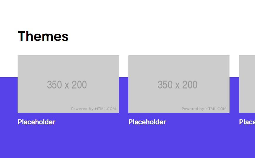
- When taken a step further, we can also split up the themes in components, where the upperhalf is rendered using the primary theme and only the bottom half is rendered using the secondary theme, to create depth like this:

Challenges
There are shared properties between themes. They probably all use the same typography, component overrides, and custom properties. We also need to pick the correct theme to render the component with.
Creating the primary theme
The primary theme is the base theme and every other theme inherits it. It can be created using the following code:
export const primaryTheme = withComponentOverrides(
  withTypography(
    createTheme({
      type: 'primary',
      palette: {
        primary: {
          main: '#FFF',
          light: '#FFF',
          contrastText: '#000',
        },
        secondary: {
          main: '#ABCDEF',
          contrastText: '#000',
        },
        tertiary: {
          main: '#123456',
          contrastText: '#FFF',
        },
        divider: `rgba(0, 0, 0, 0.20)`,
      },
      spacing: 8,
    } as ThemeOptions)
  )
)
Adding component overrides
Component overrides can be added to a theme by either using chained functions or by nested function calls. In this case we are using nested function calls.
export const withComponentOverrides = (theme: Theme): Theme => {
  return createTheme({
    ...theme,
    components: {
      MuiCssBaseline: {
        styleOverrides: {
          html: {
            fontSize: '62.5%',
          },
        },
      },
      MuiCheckbox: {
        defaultProps: {
          checkedIcon: <Checkmark />,
        },
      },
    },
  } as ThemeOptions)
}
Adding typography
Typography properties can be added as well using this way:
export const withTypography = (theme: Theme): Theme => {
  const fontFamily = 'Arial'

  theme.typography.fontFamily = fontFamily

  theme.typography.h1 = {
    fontFamily,
    fontSize: '4rem',
    fontWeight: 700,
    lineHeight: 1.1,
    [theme.breakpoints.up('md')]: {
      fontSize: '6.4rem',
    },
  }

  theme.typography.overline = {
    fontFamily,
    fontSize: '2.0rem',
    fontWeight: 600,
    lineHeight: 2.5,
    textTransform: 'none',
    [theme.breakpoints.up('md')]: {
      fontSize: '2.4rem',
      lineHeight: 3.2,
    },
  }

  return theme
}
Creating a secondary theme
Now let's create the secondary theme:
export const secondaryThemeSettings = {
  type: 'secondary',
  palette: {
    primary: {
      main: '#706',
      light: '#FFF',
      contrastText: '#FFF',
    },
    secondary: {
      main: '#FFF',
      contrastText: '#212121',
    },
    divider: `rgba(255, 255, 255, 0.2)`,
  },
} as ThemeOptions

export const secondaryTheme = withComponentOverrides(
  withTypography(createTheme(deepmerge(primaryTheme, secondaryThemeSettings)))
)
'deepmerge' is an utility function (imported from @mui/utils) which makes sure all properties are merged from the primary theme with the secondary theme.
Adding custom properties to a MUI theme
We can add custom properties to a theme by creating a new types.d.ts file in the project and then extend types given by Material UI:
import { Theme, ThemeOptions, Palette, PaletteOptions } from '@mui/material'

type ThemeVariants = 'primary' | 'secondary' | 'tertiary' | 'quaternary'
type PaletteOption = Pick<Palette['primary'], 'main' | 'contrastText'>

declare module '@mui/material/styles' {
  interface Theme {
    type: ThemeVariants
  }

  interface ThemeOptions {
    type?: ThemeVariants
  }

  interface Palette {
    tertiary: PaletteOption
  }

  interface PaletteOptions {
    tertiary?: PaletteOption
  }
}
Resolving a theme
Now the only missing piece is a ThemeResolver component which resolves and thereby set the correct theme for their children.
The code beneath could be used in a Section component or any other abstract container component.
type ThemeResolverProps = {
  activeTheme: BackgroundType
}

export const ThemeResolver: React.FunctionComponent<ThemeResolverProps> = ({
  children,
  activeTheme,
}) => {
  let theme = primaryTheme

  switch (activeTheme) {
    case 'secondary':
      theme = secondaryTheme
      break
    case 'primary':
      theme = primaryTheme
      break
    default:
      break
  }

  return <ThemeProvider theme={theme}>{children}</ThemeProvider>
}
Thanks for reading, stay curious!
Yvo Geldhof - Front-end Developer @ Macaw
writes about front-end development, game development and everything in between as long as it is about tech.